Archive for March, 2010

Maps and Web 2.0

March 30, 2010

When I first got my HDTV a few years ago, a friend immediately remarked to me that once I experienced it, I’d never be able to go back. He was right. We subscribe to cable at my house mostly because of my depressing dedication to Buffalo sports. Yet, rare is the chance that I get to watch a Sabres game in real HD and each time I get the pixilated 4:3 ratio flowing through the coaxial, I’m reminded of how I pay too much for mediocre cable. I mention this because since I’ve found myself increasingly working within Web 2.0, I have also come to expect to see it wherever I go. If I visit a site that regularly updates content and doesn’t have an RSS now, I’m puzzled. If an add-on didn’t update for the newest version of Firefox, I’m crushed. If I can’t share an article or aggregate data across platforms with the click or two of the mouse, I’m peeved. For all the love Flickr gets these days, for example, I’m amazed at how difficult it is to integrate it with Facebook. And yet there’s such cheer in these four articles. Web 2.0 knows no bounds (O’Reilly), supports proactive mapping in communities (Diehl et al), allows workers to repurpose and collaborate (Stolley), and can help elect the president of the free world (Harfoush).

While each of these texts presented their own slight utopias, I was most interested in “Grassroots: Supporting the Knowledge Work of Everyday Life,” since it seemed to best represent the potential of how Web 2.0 can help everyday folks re-purpose the familiar (and hegemonic) to move from consumers of knowledge to producers of knowledge. Plus, I just love maps.

The authors explain how they exploited Google’s API in order to help communities in Lansing, MI map their community assets – buildings, people, historical spaces, or eateries, etc. They choose maps specifically, it seems, because of their ability to present themselves as neutral entities. To those outside of geography departments, maps are usually not seen as arguments (i.e. “it’s just a bird’s eye view”), and so moving community members from readers of maps to producers of them feels like a revolutionary rhetorical enterprise. Before they make that move, however, they explore what current mapping tools exists for communities.

Specifically, they explore Public Participation Geographic Information Systems (PPGIS) tools, which, they argue, are limited because of “public participation may still be stifled by expert-centered interface designs” (419). A good example of such a PPGIS in Syracuse is this site: http://www.mapsonline.net/syracuse/. From what I can gather, it was created by folks at the Maxwell School using open source code from PeopleGIS, a company in Massachusetts. It allows users to visually interact with a sea of data within Onondaga County. Users can plot certain services (child care centers and schools), designated sites (Superfund or food pantries) bus routes, public spaces, but also certain demographic data, such as population, age, income, etc. While the site is a little overwhelming and counterintuitive, it can be powerful to those who (a) know it exists and (b) can navigate its interface and (c) can use the information in specific ways (as knowledge workers).

I’m not sure what went into planning this site, but I see echoes here of what Diehl, et al. reported finding in Lansing. There, the authors identify a site supported by local and federal governments called ArcMIS, which community members found difficult to navigate and use. And while this map in Syracuse doesn’t highlight deficits (crime, for example, isn’t map-able), it doesn’t allow citizens to really participate, to remix it, in any way. Plus, judging from the site’s dead links, it’s outdated and hardly used. I think this is one of the fundamental problems with Web 1.0 – maintenance. I imagine Maxwell received a hefty grant to launch this site and now it sits dormant.

While I realize Web 2.0 doesn’t entirely solve the maintenance problem (I’m thinking of how moderators had to tenaciously monitor posts on MyBo sites), I love that Grassroots provides users with a writing tool – not a read-only site like ArcMIS or the Onondaga County site.  By encouraging users to build their own maps using an interface with which they might already be familiar – Google Maps – Grassroots develops a sustainable process that has users creating texts “that can be easily syndicated, repurposed, or added upon” (424). I’ll be curious to see where Grassroots heads in the future. The site is still in Beta test mode, but it has me wanting to do a little walking tour of my own neighborhood soon.
Info Design and Zines

March 9, 2010

Before the service economy/information age 2.0, I imagine that life as a “document designer” was more or less straightforward. I picture a garden-variety computer geek using Pagemaker or Quark to layout product manuals for telephones or lawnmowers with more or less fixed deadlines, formats, and boundaries.

At least two of the texts we’re reading for 760 this week on information design, however, emphasize the need for technical communicators to consider function over form because of the sheer expansion of information available. As Albers puts it “People simply cannot efficiently sort through and process the amount of information they have access to” (1); similarly Salvo and Rosinski note that “Search and retrieval – or findability – as well as navigability become increasingly important as the information age produces more documents than ever before” (103). As obvious of a problem as this is, I dig Salvo and Rosinski’s call for real digital literacy, an attempt at understanding what this saturation means for writers. When I think about this saturation, I think about how much it’s impacted authorship beyond the technical writer. As Salvo and Rosinski note, “Attention to design most recently has focused on the placement and articulation of information (data) within documents as well as on finding, contextualizing, and placing any document within larger conversations and collections (metadata)” (105; emphasis mine). The spatial metaphors become essential, as Salvo and Rosinski make clear, to placing documents in a context that communicates scale, navigation, locatability, etc. (110). This applies to researchers in graduate courses as well as zinesters.

Wait. Zinesters?

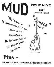
Alright. While editing, writing, and laying out two fanzines hardly qualifies me as an “information designer” – or maybe the zine’s ethos actually precludes me from weighing in here — these chapters had me thinking back to those DIY days, especially since my two zines were designed in different mediums (print/web), in different decades (1990s/2000s), and in different subjects (music/creative NF). Mud, my print zine from the 90s, were released as separate issues (twice a year, maybe?) whereas The Onanist, my webzine from the 00s, eventually became an ongoing, weekly endeavor. In fact, by the end of its two-year run, we were microblogging daily on side frame while rolling out new content – stand-alone stories, interviews, art – weekly.

Thinking back, though, I had trouble with the transfer from print to digital – the same trouble that Salvo and Rosinski mention technical communicators had in the late 90s: “At that time, designers of new Web site construction ignored effective design principles, even at times asserting that effective document design developed for the page did not and could not apply online” (106). Despite having purchased Dreamweaver and Photoshop how-to manuals, I initially started The Onanist by rolling out separate “issues” (see Issue 2 right there) and changing the masthead each week. These were print decisions in hindsight – leftover principles from Mud.

After a while I figured out that the best set-up would be something more fluid, a model that worked with the boundlessness of the web. After two years we actually produced so much content that management became a major issue and transferring the architecture or look of the zine was a major hassle. CSS? XML? CMS? Whatsa what? The only acronym I knew was PITA. And now that the project is defunct (died the day I left my MA program, sadly), the zine exists only as a chopped-up relic on my hard drive with files scattered and links broken. At least I still have every copy of Mud, right through to the last issue (above, left).

While I have no intentions of starting another webzine soon, the major lesson here seems to be that when it comes to information design, it’s important to think about broader contexts for which individual documents will be designed into (“the sponsors,” as Carliner put it). As the Writing Center considers building a stronger, more expansive resources page, for example, it’ll be important to think through the designs of those pages within the larger context of the institution, the WP, and the WC sites. In fact, as I think back to last week’s discussion on CM and the WC, I wonder how much of that conversation would fit into our discussion tomorrow. Are other folks seeing some strong overlap between CM and ID? I have a feeling there will be more when we get to usability after break.